SPARE® Skincare
Type of Project
Branding and Packaging
Date
August 2026
Challenge → SPARE started from a personal frustration. I've always struggled to find a moisturizer that worked for me, not necessarily because of how well it hydrated, but because of how it felt afterward. Being highly sensitive to certain textures and sensations, the stickiness, greasiness, and lingering feeling of traditional lotions made something as simple as moisturizing uncomfortable. I wanted to explore what a personal-care brand could look like if it started from that exact problem: wanting the benefits of skincare without having to feel the product on your skin all day.
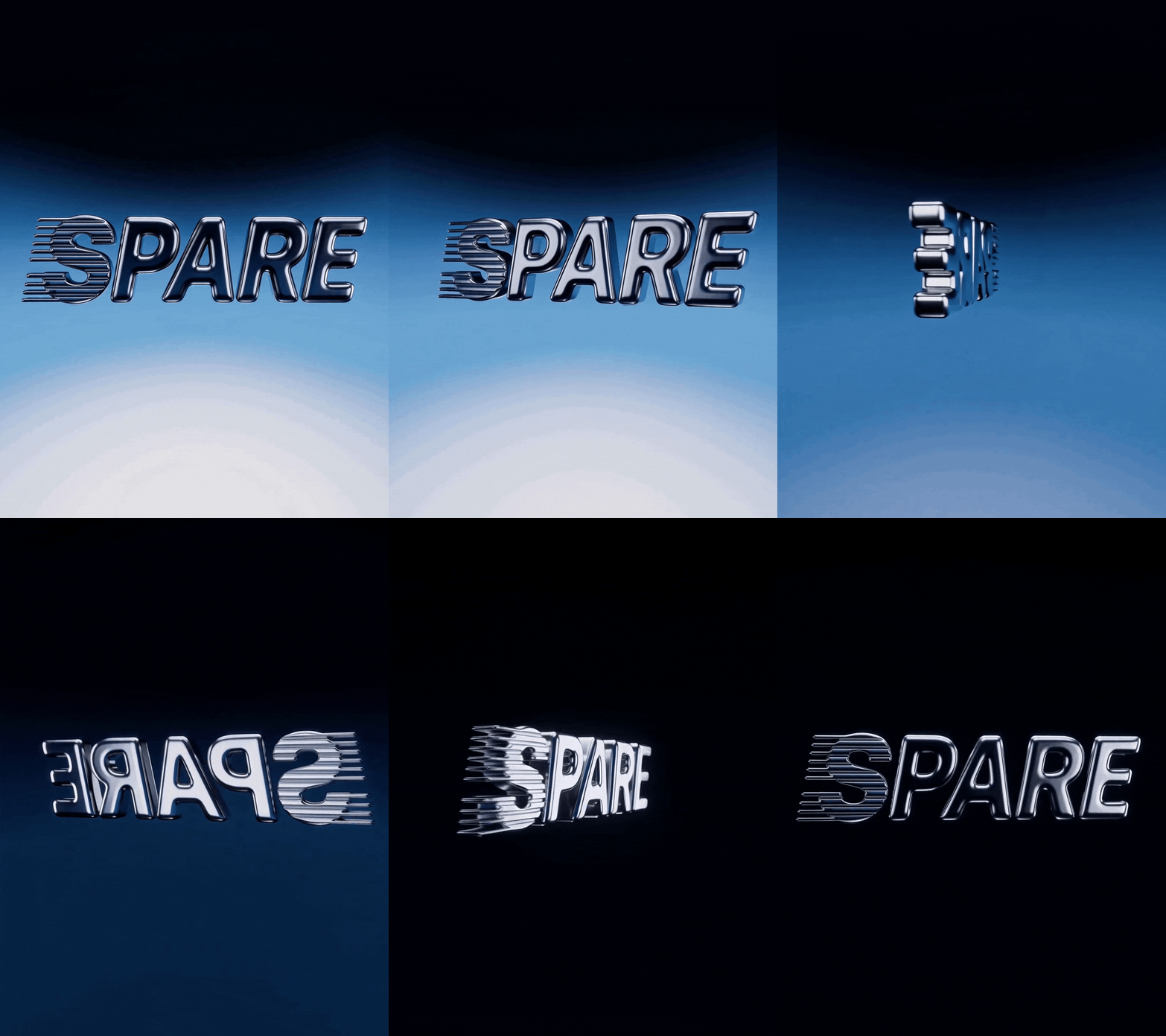
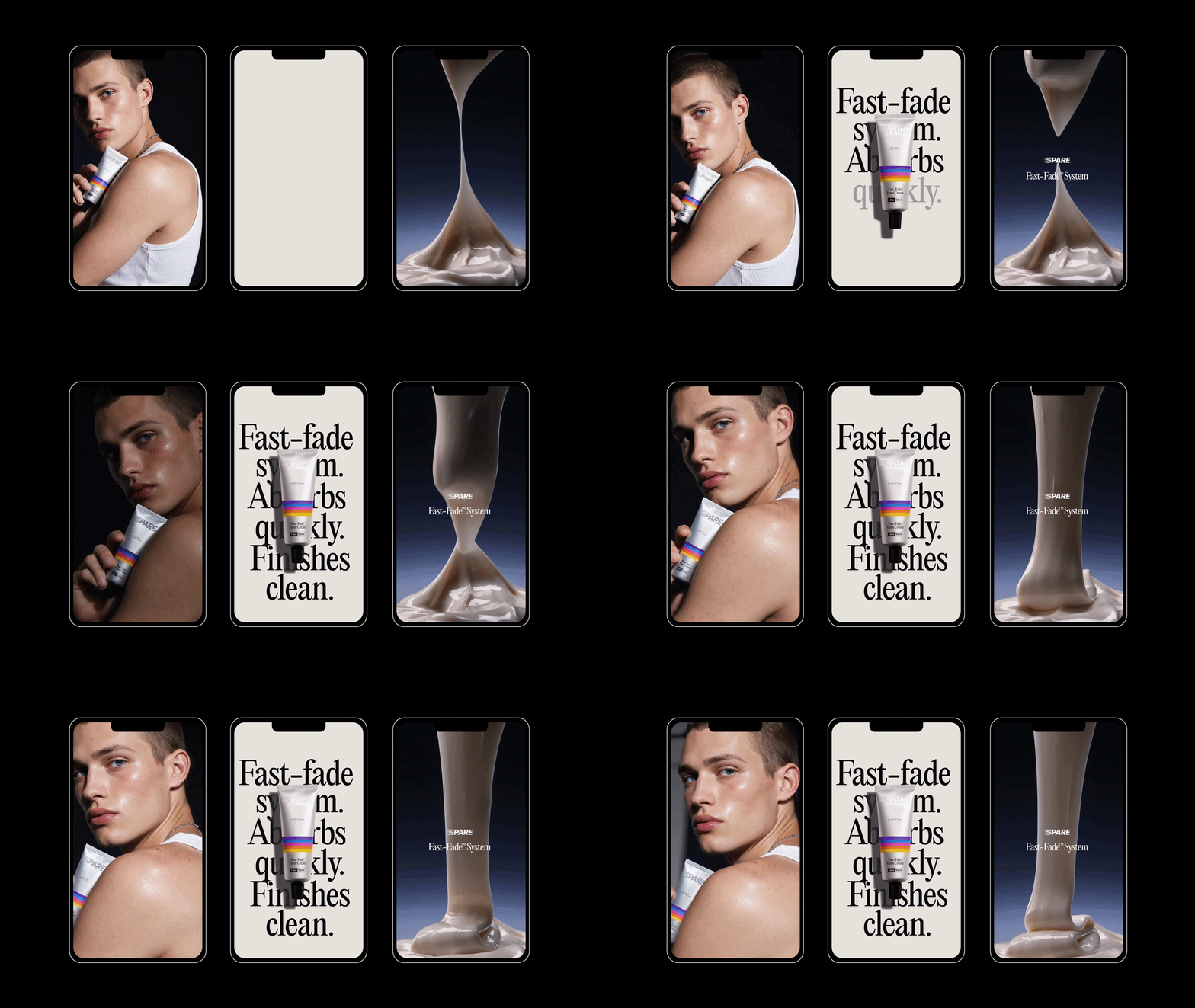
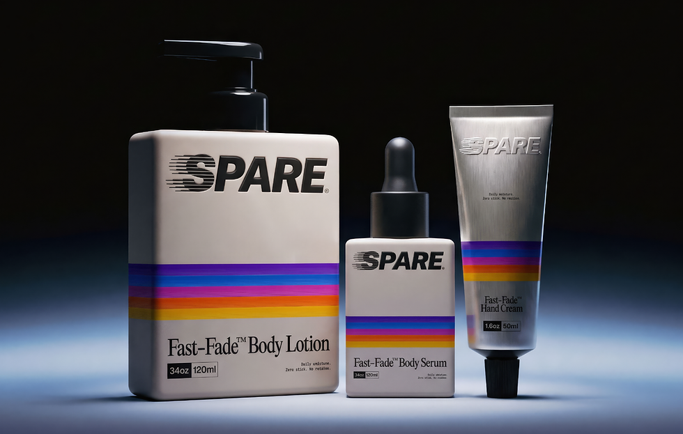
Concept → The name SPARE comes from the idea of being spared from the unnecessary. Less stickiness, less residue, less waiting around. Just hydration. This idea became the foundation for the Fast-Fade™ System, a concept built around moisturizing products that absorb quickly and leave a clean, weightless finish. I wanted the identity to communicate that same feeling of speed and disappearance. The logo uses a motion-inspired treatment that suggests movement and fading, while the rest of the visual system balances bold graphic elements with a more utilitarian approach to skincare.
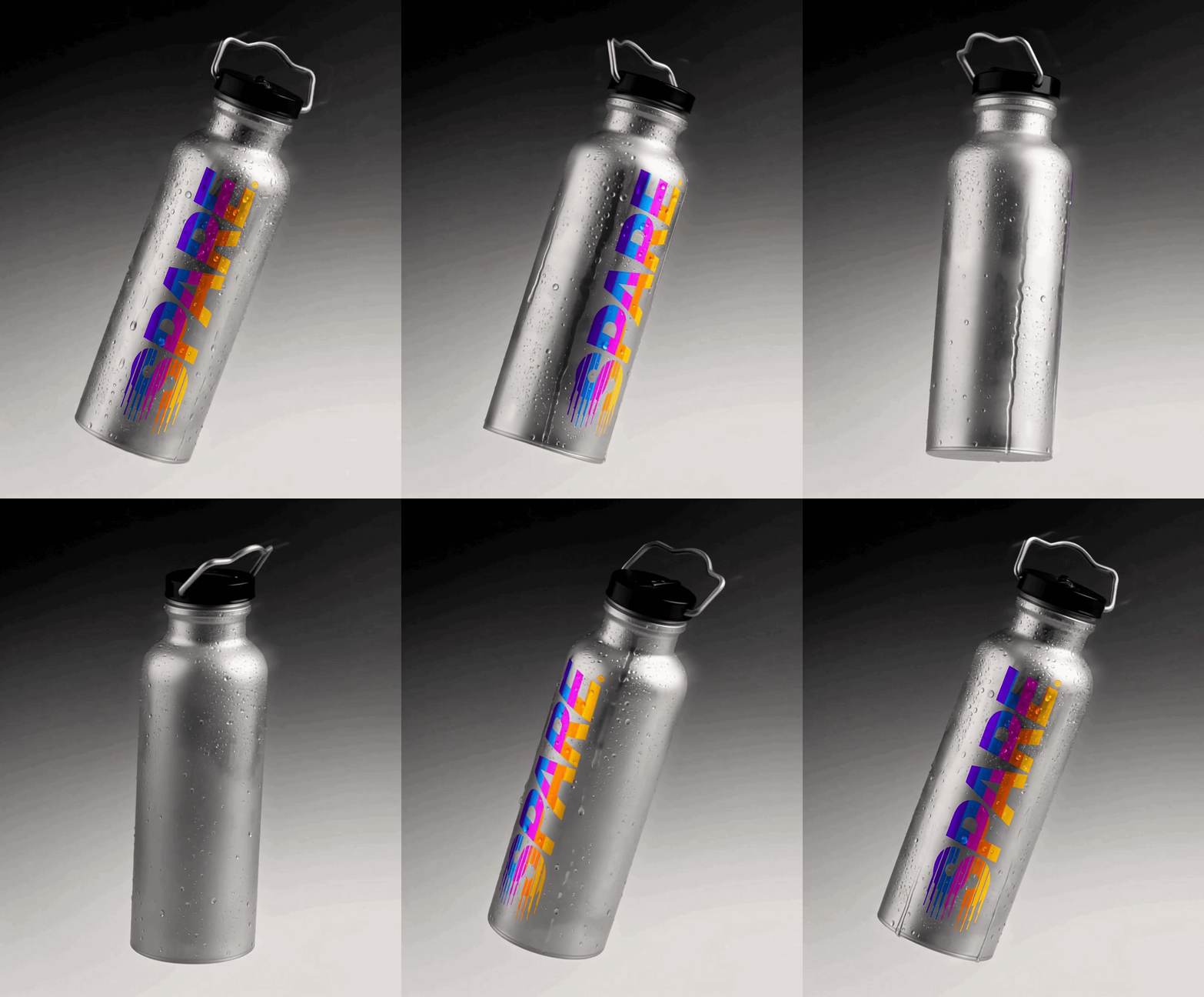
Results → A cohesive brand identity that translates a personal sensory frustration into a recognizable skincare concept. A packaging system that balances everyday functionality with a bold visual personality.A flexible visual foundation that connects product design, photography, typography, and campaign communication across the SPARE product range.